

After completing the Laughing Tortoise sign I could hardly wait to get going on the next piece of pub art.It would be the gilded guppy ale sign. The owners has asked for the signs to reflect a whimsical English feel. This little fish (inspired by the art of James Christiansen) begged to be brought to life. The crown and Union Jacks give it the British feel. Our pub is in Aldergrove, British Columbia. On a whim I did a search and located three places in the UK that are called Aldergrove. This gave the sign instant credibility and made it authentic. The fish will be gold of course. I know it isn't a guppy, but then again it is not a real ale either.
All of the sign is to be routed from 30 lb Precision Board.
All of the sign is to be routed from 30 lb Precision Board.

The owners likes the flags so much we used then in a similar fashion on their main signs. Since I didn't want to repeat myself I flattened a single flag out for this sign. The vectors, created in Illustrator and EnRoute looked like this.
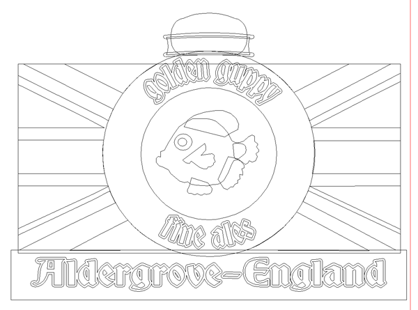
I showed the process of creating the fish in another post so I'll leave it out here. For the rest of the sign I separated the vectors to create the reliefs in two layers. The colored portions of the flag were added as raised reliefs - all of it flat. The round portion in the middle was subtracted from the relief and then a bitmap applied to create some texture in this portion. The crown was built as simple shapes and then modified with the oval around it. All the elements were built separately.

I wanted the flag to have a slight wave to it, higher in the middle. To do this I used a simple fade bitmap, created in Photoshop in a few seconds. The thing to remember is that black does nothing, white raises the relief to the amount you enter. Grays do in between, depending on their value.

The front view looked like this.

The finished file was merged together and tool pathed in readiness for the router. I can hardly wait to get started on the finishing...

-dan